How industrial cities painted the signs of the times
When an enormous advertisement took the place of A-No.1’s moniker on Yerba Buena Island, it was based on a truth about letters: without making any sound, they can be extremely loud.
A-No.1 had screamed his moniker at San Francisco; thousands of people heard, but he hadn’t made a peep. Written messages pour through openings in our collective consciousness, finding seams, filling spaces. In commercialized cities these spaces are, almost inevitably, the market. Money talks but brands bellow—the urban landscapes of the 19th century, therefore, wailed with the sound of silent bazaar barkers: signs.
Commercial signs existed long before they used letters. Their origin is in the name: signs were signs—symbols that displayed the type of business carried on beneath them. The cities of Ancient Rome were full of these trademarks, including the red and blue barber’s pole we’re still familiar with.

Roman shops often appeared in the ground floor of houses, small spaces called tabernae. Where the Roman Empire expanded, Roman retail followed. In Britain, the ale houses that opened in tabernae came by the name “tavern”. In the early middle ages, these semi-public spaces were critical meeting places at the heart of communities. In the 14th century, ostensibly to regulate the quality of ale, King Richard II mandated that each tavern hang a sign out front. Presumably, the royally appointed beer tasters were illiterates as well as drunks, so taverns relied on physical objects and increasingly colourful visual elements to distinguish themselves.
The story in the 19th century was different. Cities had exploded in population, and that population was more literate than ever. The tavern could now paint its sign using letters, their names based on the lively images in their old visual signs. And taverns were far from the only business in town: all kinds of shops sold goods marked with printed labels, and they too branded themselves with lettered signs.
Sign painting in the 19th century was serious business. There was no way at the time to print anything large enough to cover the side of the building. The task, therefore, fell to craftsmen who designed, planned, and painted signs. This was not easy; not only did sign painters work at heights and require a steady hand, they had to visualize and create something that they couldn’t possibly see in its entirety from arm’s length.

In 1871, sign painter and “Traceotypes” purveyor James T. Gardiner published a sign painter’s guide to demystify the trade. At its heart is a system of proportions applicable to Roman, Sans Serif, and script types. Essentially, he used a grid to set letter proportion and spacing, then scaled that up on the wall. While he found Sans Serifs easier to render than Romans, they were given to spacing and sizing errors. The serifs of Roman letters enforced their regularity—a point both Edward Catich and Christopher Latham Sholes would appreciate. Gardiner’s own veteran savvy in the trade is on display in some of the finer hints: extending rounded letters slightly below and above line, the bottom curve of a “C” should be slightly longer than the top curve. He also recommended a visual hierarchy for multi-line signs, including favouring Sans Serifs for less important lines and smaller lettering for one-word lines.
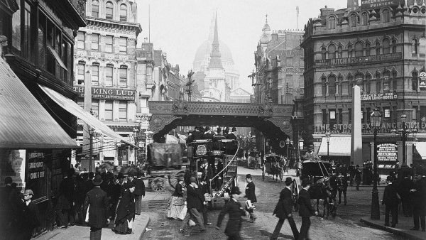
Painted signs transformed the city. Windows bore gold-leaf lettering. Enamelled tin hung off storefronts. Even storeys-tall blank walls became canvases for the advertiser’s art. Physical spaces in the city were already dominated by industry and commerce—painted signs took over even the two-dimensional spaces, contributing visually to the physical crowding and pollution that characterized industrial cities.
Through it all taverns hadn’t changed much. They’d taken the name “pub”, a shortening of public house. It was a name well earned: by retaining meeting space in the heart of communities, pubs had provided oases of public space in the privatized city. The communities that used these spaces recognized the stress posed by continued industrial growth in increasingly unlivable cities. Gradually, cities changed, building sewers and public parks, protecting drinking water, and organizing space in streets for efficient movement of people and goods.
This last effort called for a different kind of lettered sign: the street sign. Way-finding signs were nothing new, but their application in cities exploded. Train passengers, bicycle riders, and eventually car drivers all navigated a city in ways that would have been impossible without signs. Cities had made letters bigger and more important than ever; they would bring us some of the most iconic and functional typefaces of all time.
Meanwhile, back in the presses, major advances in mechanization were changing fonts. Printing was also getting bigger than ever.