How handwriting held a resilient role in a world changed by printing
Starting with the de Spira brothers and the advent of Old-Style Roman fonts, Letters has tracked a centuries-long typographical trend away from script. The introduction of moveable type changed how we consumed letters. Mass produced books and leaflets saturated the market and, apparently, alienated readers’ eyes from writers’ hands.
Given that BLKBK is a foundry specializing in scripts, it’s worth repeating the fundamental question behind Letters: How did we get here?
As a piece of technology, moveable type is reducible to an improvement in metallurgy. The first printers were smiths who got good enough at working with metal that they could make a lot of tiny, intricately detailed metal pieces. Metallurgical improvements changed writing too.
The first scribes wrote with a chewed reed brush. For thousands of years, and for centuries longer in much of the world, the brush remained scribes’ preferred writing instrument. It remains BLKBK’s weapon of choice; nothing else offers the flexibility and raw, expressive potential. But scribes weren’t always interested in expressive potential. For about as long as scribes used brushes, they also used pens made from reeds.
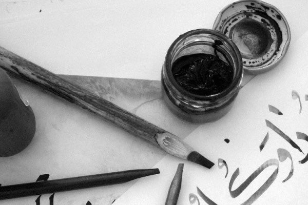
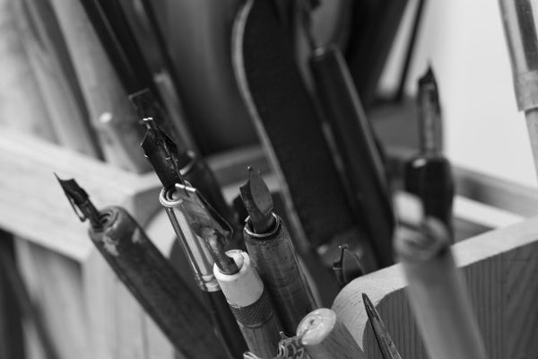
The reed pen is a fine tool—the Qalam remains the ideal instrument for Islamic calligraphy—but in the Early Middle Ages, European scribes found a choice writing instrument in goose feathers. With the tip cut square to make a writing point, the hollow shaft of the feather held ink, allowing a scribe to write longer between reloading. This advantage (and a relative abundance of geese compared to suitable reeds) would make the quill the predominant writing instrument in Europe for a thousand years—a dominance that would extend hundreds of years after the advent of printing.
That’s because people never stopped writing. While printed material quickly dominated commercial, literary, and religious applications of letters, every printed book started out as a written manuscript. Every correspondence, note, sign, edict, love letter, death threat, invitation, and resignation that happened in writing usually never saw a printing press. In the scope of all literary activity, far from dominating, printing remained a specialized tool at the fringes of the masses of letters. In fact, in as much as printing spread literacy, printing made people more likely to write, not less.
Script hadn’t gone anywhere. It even developed according to the same tension between personal expression and uniformity as all letters. On one hand, handwriting remained personal, evidenced in its use as signatures. But its broad use in other applications called for rationalization.
Various styles of script had emerged through the Middle Ages. Their popularity varied depending on location, and different scripts held different advantages or disadvantages that made them more or less appropriate for a given function. Secretary was fast and easy to write, making it the preferred script of merchants. Italic cursive was considered more attractive but still legible and easy to write, making it a favourite of aristocrats. But those virtues made italic cursive easy to forge and an inappropriate choice for signatures, which were supposed to demonstrate authenticity. To prevent forgery of official documents, court scribes developed increasingly elaborate and challenging scripts. Facility with these scripts became a mark of education and class.
Metallurgical advances, meanwhile, opened new possibilities for scripts. Metal nibs emerged as a viable but very expensive alternative to quills in the 17th century. A luxury good, writing produced with a metal nib spoke to the wealth and class of the writer. Their split, flexible tips allowed gentle changes in pressure to produce wider or thinner lines, allowing beautiful contrast through curves, as seen in the work of master calligrapher John Ayres.
Ayres started work as a footman for a London Alderman, who gave him a chance at an education. Becoming an adroit writer allowed him to transcend his background; he went on to publish several books on calligraphy, and developed the Round Hand style.
The population of British America—very literate by 18th century standards—overwhelmingly favoured Round Hand. John Hancock was an excellent penman, educated in the style by one of the best calligraphy teachers in Boston. His elaborate signature on the American Declaration of Independence didn’t just tell King George that someone named John Hancock believed in the content of the declaration, but that John Hancock was—at least in penmanship—the King’s equal.
John Hancock would later endorse a handwriting guide with a radically new pedagogical approach. The Art of Handwriting by John Jenkins taught a stripped-down, unornamented Round Hand, based on Jenkins’ analysis of writing into six fundamental strokes. With an understanding and mastery of the component strokes, anyone, John Jenkins taught, could become a great penman. He was right. Good writing had been unattainable by all but the most dexterous with ample time to practise; Jenkins’ system democratized writing and put it at the centre of an emerging culture: the great American middle-class.
Early in the 19th century, another writing teacher, Platt Roger Spencer, created the definitive American script, Spencerian Cursive. Inspired by John Hancock’s own writing, Spencer’s angled, oval-shaped letters proved fast to write and more elegant than the workman-like Round Hand styles that had followed Jenkins’. Spencerian Cursive would remain the de-facto script of American business decades into the 20th century.

It also proved supremely iconic. Spencerian Cursive is the script used in logos for both Coca Cola and Ford. Thus, a process that started with the Romans side-stepping bad handwriting to create a display type, had come full circle, with handwriting as the display type. Along the way, it shed personal meaning for the sake of utility, gained social meaning in its place, shed that to enhance personhood, and finally became a personal flourish in the branding of impersonal corporations.
This would mark script’s apogee—at least for a while. Print was far from finished growing, and new technology was about to push writing right off the page.