Man Eater Font - Third Rail from BLKBK Type
According to a 2015 Ipsos poll, 51% of Americans* agree: sharks are absolutely terrifying. And why not? Any given shark may have literally thousands of teeth, 360 degree vision, and eaten its embryonic siblings in the womb. These are apex predators in a part of the world we humans just don’t belong—the ocean. It’s wet, it’s cold, it smells weird, and sharks are there to remind us to stay out.

But what if we could be the sharks?
Thanks to the magic of video games, we can. In Man Eater, a third-person action-RPG, you take control of a baby shark, eat things, grow, eat bigger things, grow bigger, until you finally grow big enough taste the sweet flesh of man. In packaging this game for human consumption, Tripwire Interactive needed a tasteful, toothsome typographic solution. They got a bite at BLKBK.

What font does Man Eater use?
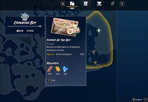
Man Eater makes extensive use of BLKBK Type’s font Third Rail. We crafted this font by hand, using swift and energetic motions, slashing ink across the page like shark through sea, like teeth through meat. Third rail balances the spontaneity of a feeding frenzy against the deliberate motions of the hunt. The result it a three-course typographic meal, distinctive and robust enough for Tripwire Interactive to use extensively in marketing materials and in game.
*The rest swim strapped, as ought we all.
Sharpen up; download the Man Eater font here.
